AVE.26

AVENUE TAMPA · TAMPA, FLORIDA · 2026

Ave Tampa roundel logo

LAUNCH
SZN.

AVENUE TAMPA OPENS SEPTEMBER 27. THIS IS WHAT THE ROOM LOOKS LIKE, SOUNDS LIKE AND HANDS YOU.

The visual system for launch season — the building, the screens, the installations and the film. Return to Sender opens inside it on the same Sunday and runs four weeks.

LAUNCH SUNDAYSEPTEMBER 27, 2026 · 10:00 AM
SERIESRETURN TO SENDER · FOUR WEEKS
SERIES RUNSSEPT 27 → OCT 18 · OCT 25 BYE
GOVERNSSOCIAL · DIGITAL · ENVIRONMENT · STAGE · PRINT · FILM
GATHERINGSSUNDAYS 10:00 AM · TUESDAYS 7:00 PM
ROOM4300E BROADWAY · TAMPA, FL
PREPARED BYYOUNG CREATIV
01

THE DAY

Two things happen on September 27. The building opens, and a new series starts. They are not two campaigns. The launch is the door. The series is the first thing said once everyone is inside.

WHAT LEADS

THE LAUNCH

Launch owns the room, the street, the feed and the first ninety seconds of the service. It is loud, red, and impossible to mistake for anywhere else. This is the look that carries the whole season — not just opening day.

WHAT FOLLOWS

THE SERIES

Return to Sender lands inside the launch look rather than beside it. It shifts to a hotter red and a paper ground, adds a postal register — stamp, postmark, label, hand — and gets four weeks. The sermon package is the only place a second colour appears.

THE CHURCH'S OWN WORDS

Nothing in this system invents a new voice for Avenue Tampa. It amplifies the one that already exists — the language below is the church's, and it is what the type on the walls is drawn from.

THE SAYING

"Build a creative church that looks like heaven." The one line everything in this deck is accountable to.

THE MISSION

"We exist to connect people from all walks of life to the hope and love of Christ."

WHAT AVE IS

"A Hub for Creativity, Christianity & Cultural Uniqueness." The look has to be able to stand next to that claim without embarrassing it.

THE TENSION WORTH NAMING

"It's never been about buildings or numbers. It's always been about transformed lives." A building is opening anyway — so the building has to talk about something other than itself.

Ave roundel logo in white on a red-orange ground
ID 01 · The roundel. Primary mark, reversed out of red. Sits alone, never inside a lockup with other type.
Avetpa wordmark in white on a dark ground
ID 02 · The wordmark. Used small and in utility positions — credentials, footers, merch labels.

THE SAYING

BUILD A CREATIVE CHURCH THAT LOOKS LIKE HEAVEN.

02

THE LOOK

THE BIG IDEA

TYPE IS THE BUILDING MATERIAL.

Not type placed on a surface — type that becomes the surface. Words run across the floor, up the stairs, over the ceiling, around the door frame and off the edge of the frame. The room is built out of what it has to say.

Two benchmarks, and they point the same way. The saying — build a creative church that looks like heaven — is the ceiling: it means the room has to be made with real care, not decorated. The Disney standard named on the planning call is the floor: you know where you are even in the bathroom. A first-time guest should be able to stand anywhere on the property and know, without reading a sign, that they are at Avenue Tampa on opening day.

"Looks like heaven" is not a style instruction and it is not gold and clouds. It means every surface was decided on. Nothing left half-finished, nothing borrowed, nothing that looks like it was printed the night before.

This is also why the system is loud rather than tasteful. A brand-new building has no history in the room yet. Red and scale are doing the work that a familiar space would otherwise do for free.

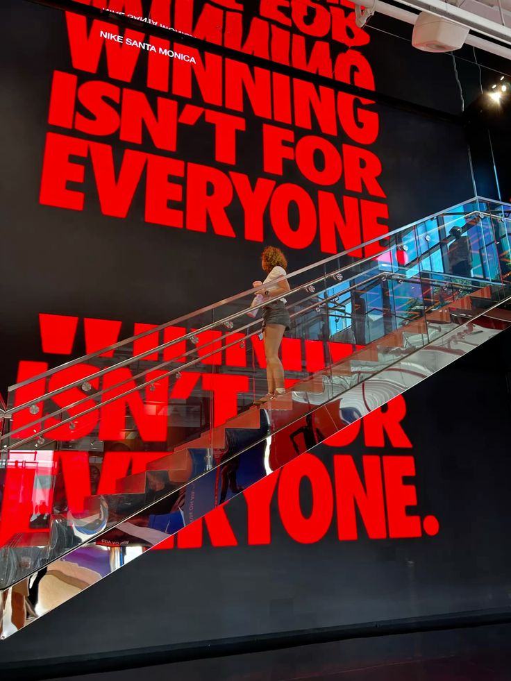
Oversized red type wrapping a staircase and wall in a retail environment
L01 · Type sized to architecture, cropped by the stairs. The wall is not a poster — the wall is the sentence.
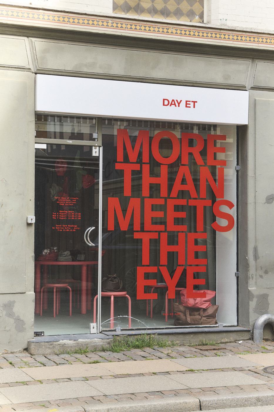
Storefront window with large red vinyl type reading MORE THAN MEETS THE EYE
L02 · Window vinyl at full height. Reads from the parking lot before anyone reaches the door.
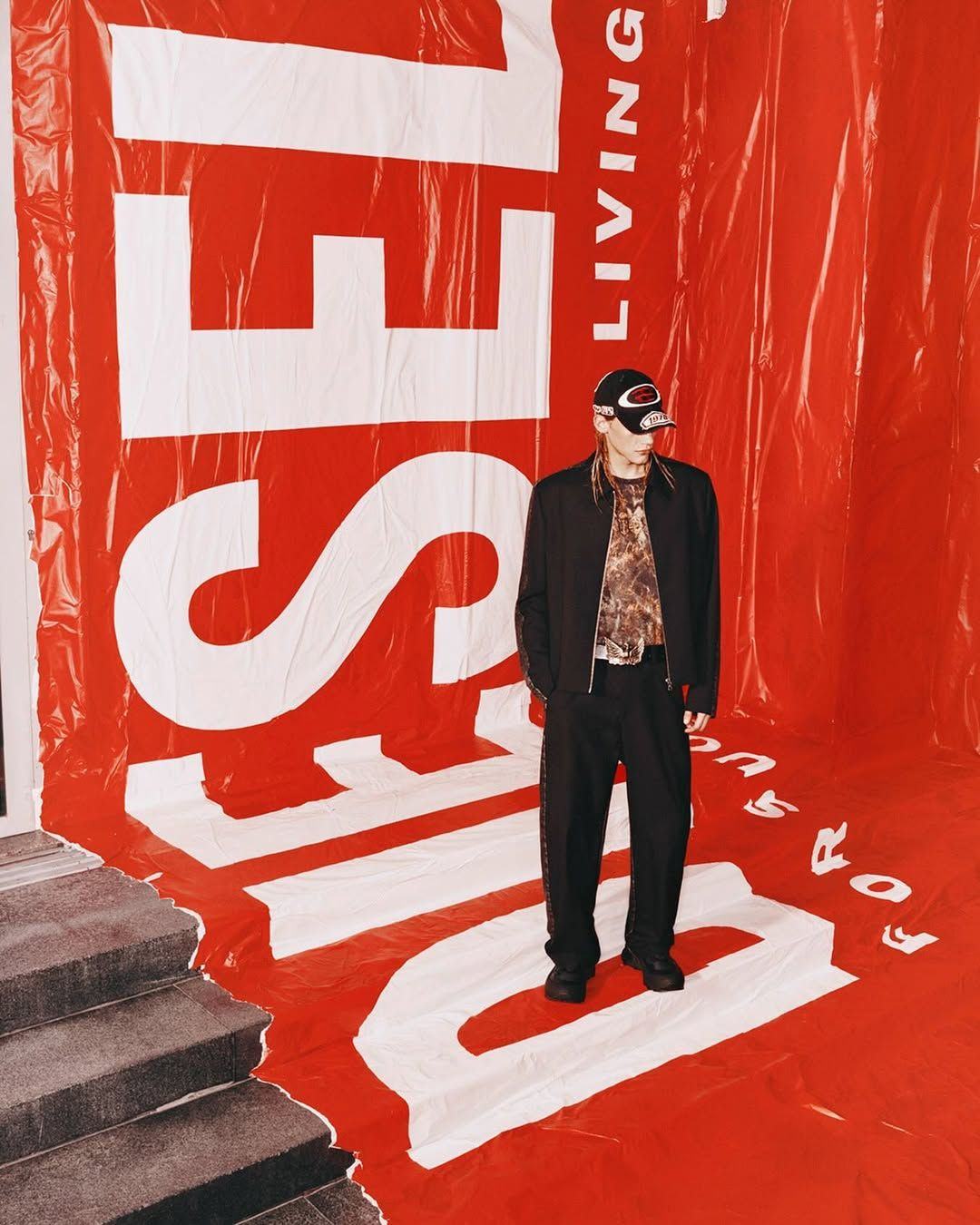
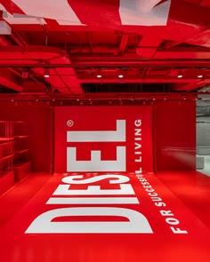
Red vinyl covering floor and wall with giant white logotype
L03 · Floor and wall treated as one continuous surface. The cheapest way to change a room completely.
03

TWO STYLES

The season runs two design styles that must stay visibly different. If someone can't tell which one they're looking at, one of them has been applied wrongly. The split is not decorative — it maps to what the thing physically is.

STYLE ONE · THE LAUNCH

PAINT ON THE WALL

Architecture. Anything fixed to the building or filling a screen — walls, floors, windows, stage, LED, film. Type is sized to the structure and cropped by it. Nothing here is precious or handled.

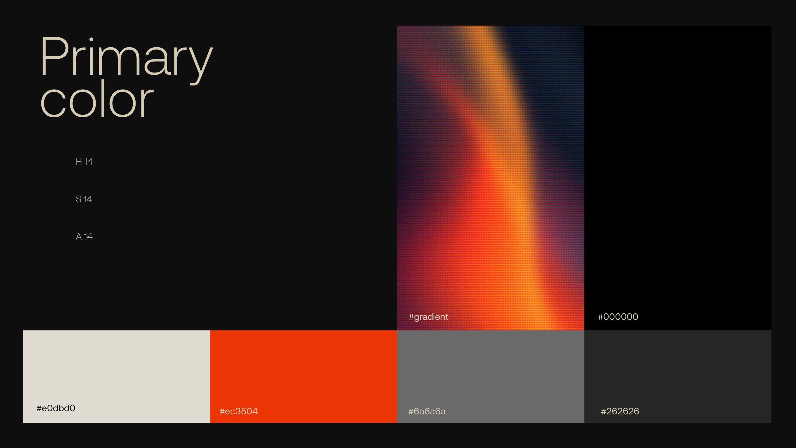
GROUNDBlack or Bone. Flat, hard, no texture.
COLOURAve orange #EC3504 on black or bone. Grey and charcoal are the only neutrals.
TYPEHeavy grotesque, condensed and enormous. Edge to edge, allowed to crop.
EDGESHard. Straight cuts, hairline rules, right angles.
TEXTURENone. Flat vinyl and paint — the building supplies the wear.
FEELSPermanent. Like it was always going to be there.

STYLE TWO · THE SERIES

INK ON PAPER

Printed matter. Anything that could physically pass through a postal system — stamps, labels, postcards, envelopes, the bumper before the message. Small, handled, stamped, cancelled. It sits inside the launch, never replaces it.

GROUNDPaper and Kraft. Visible stock, grain and crease.
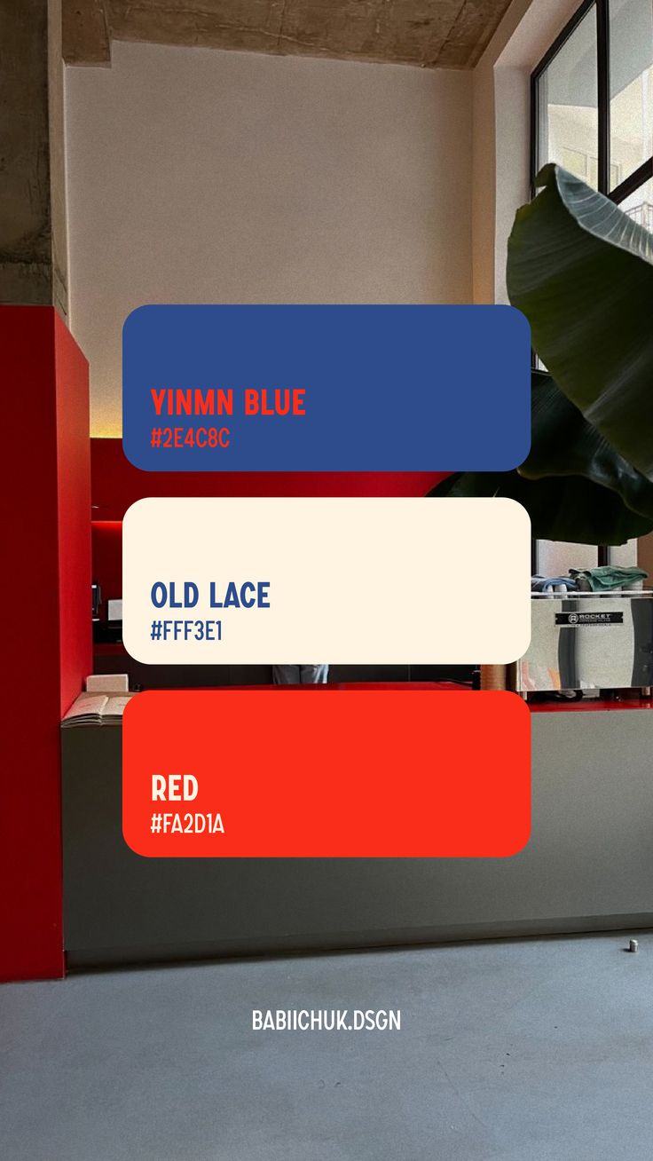
COLOURThe same #EC3504 on Old Lace and Kraft. YInMn Blue in the sermon package only.
TYPEBootzy Condensed, over-inked woodblock. Broken edges, uneven impression.
EDGESPerforated, dashed, torn. Things are rotated a degree or two off square.
TEXTUREEverything. Postmark, cancellation, rubber stamp, misregistration.
FEELSTemporary. Like it arrived, and could be sent back.

HOW TO TELL THEM APART

TESTPAINT ON THE WALLINK ON PAPER
SCALEBigger than a personFits in a hand
THE COLOUR#EC3504, flat and even#EC3504, over-inked and broken
GROUNDBlack or bone, flatPaper and kraft, textured
FINISHClean, no wear, screen-readyWorn, creased, cancelled
CORNERSSquarePerforated or torn
ROTATIONDead levelOne or two degrees off
LIFESPANThe whole seasonFour weeks
BLUENeverSermon package only

WHERE THEY MEET

On launch Sunday both are in the room at once, and that is the point — the building is painted, and the thing being handed to you is printed. They share the red and nothing else. Never blend them: no perforated edges on a wall graphic, no flat vinyl treatment on a postcard, and no paper texture anywhere on the building.

04

THE COLORS

Two palettes, one through line. One colour, two treatments. Ave orange #EC3504 runs through the entire season — nothing else is ever the accent. The launch lays it flat on black and bone, clean and screen-ready. The series over-inks the same orange onto paper and kraft, where it breaks up and wears. Same colour, different ground and finish, and that is the whole difference.

LAUNCH — THE BUILDING

THE OFFICIAL AVE PALETTE

Straight from the 2025 brand guide — no additions, no substitutions. Environment, stage, film, social and merch all sit in this. Nothing on the launch side uses a colour that is not on this list.

AVE ORANGE
#EC3504
The primary, everywhere. Walls, vinyl, type, screens, print. Never tinted, never shifted toward red.
BLACK
#000000
Ground. True black — the orange needs a hard edge to sit against.
BONE
#E0DBD0
The light ground and all reversed type. Warm off-white, never pure white.
GREY
#6A6A6A
The neutral. Secondary type, rules, utility information. Never a large field on its own.
CHARCOAL
#262626
Panel and card tone. Separates a block from the black ground without introducing a fifth colour.
THE GRADIENT
BRAND ASSET
Supplied in the guide as artwork, halftoned. Motion backgrounds and screen beds only — never behind body type.

No tints, no in-between steps. If something needs to sit back it goes to Grey or Charcoal — it does not go to a lighter orange.

SERIES — THE MAIL

RETURN TO SENDER

Hotter and cleaner, because it is printed matter rather than architecture. Used only on series assets — never on the building.

AVE ORANGE
#EC3504
The same brand orange as the launch, printed rather than painted. Series print, social and bumpers.
OLD LACE
#FFF3E1
Series paper. Brighter and cleaner than the launch Bone — a fresh sheet rather than a painted wall.
YINMN BLUE
#2E4C8C
Sermon package only. Slides, lower thirds, message titles. Nowhere else, all season.
KRAFT
#C0AE92
Parcel and envelope stock. Physical series pieces only.
Avenue Tampa brand guide primary colour page showing bone, orange, grey, charcoal, black and a gradient
C01 · LAUNCH — The primary colour page from Avenue Tampa's 2025 brand guide. This is the source of record for everything on the launch side.
Palette card showing YInMn Blue, Old Lace and Red swatches
C02 · SERIES — Red against old lace, blue held in reserve for the sermon package.

TYPE

The brand face does the launch. The licensed series face does Return to Sender. Mono handles anything that behaves like a label. Everything is set in caps.

SERIES DISPLAY
AA

BOOTZY CONDENSED TM — the licensed face for Return to Sender. Buy from 6TM before artwork starts. It is not a web font, so this deck substitutes a condensed heavy grotesque; final artwork uses Bootzy.

LAUNCH DISPLAY
AA

HELVETICA NOW DISPLAY — the brand typeface, per the 2025 guide. Every launch surface is set in it, weight and width pushed to suit the scale. This deck substitutes a close grotesque for the web; final artwork uses Helvetica Now.

UTILITY
AA

Mono for dates, times, credentials, captions, run-of-show and anything that behaves like a label. Never used for a headline.

TEXTURE

TEXTUREHOW IT IS USED
WOODBLOCKBroken, over-inked letterforms. The series grounder. Applied to type that is already well set — never to fix bad typesetting.
PAPER GRAINCrease, fold, scan artefact. Anything that is supposed to have been handled.
MISREGISTRATIONRed and blue printed slightly off each other. Sermon package only.
FLAT VINYLNo texture at all. Environment and window graphics stay clean — the building supplies the wear.

Woodblock, crease and misregistration belong to the series only — see section 10. Launch surfaces stay flat and hard.

05

HOW TYPE BEHAVES

Five rules. They apply to a story frame and to a thirty-foot wall equally — that consistency is what makes the season read as one thing.

FILL THE FRAME

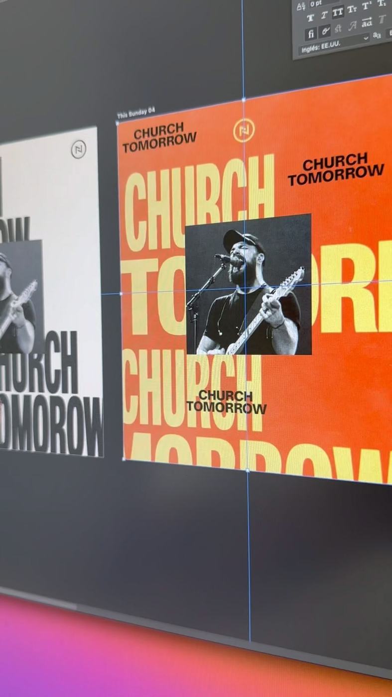
Type runs edge to edge and is allowed to crop. No centred stack floating in space with air around it. If there is room left over, the type is too small.

REPEAT UNTIL IT IS AN ENVIRONMENT

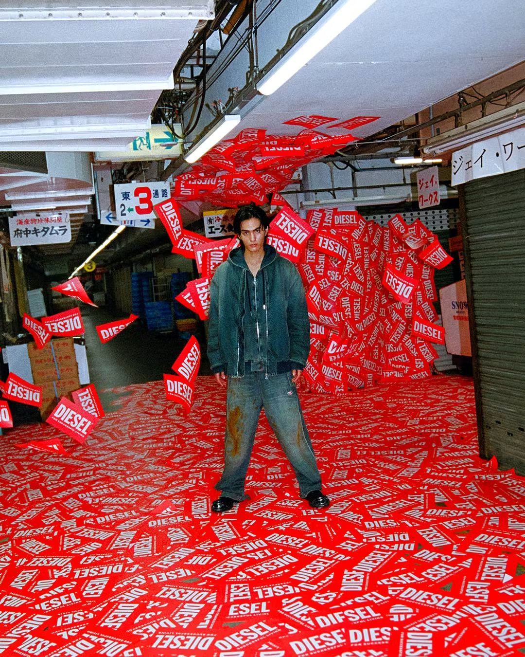
One poster is a poster. Forty of the same poster is a room. Budget quantity over size — a hundred small prints beat one large banner every time.

FOLLOW THE SURFACE

Type bends around corners, runs up stairs, wraps the ceiling, continues onto the floor. It should look like it was applied to the building, not printed on a rectangle and hung there.

ONE VOICE PER SURFACE

A surface says one thing. If it needs two things, it needs two surfaces. Utility information goes small and in mono at the foot.

SET IT CLEAN, THEN BREAK IT

Distress is applied to good typesetting. Kerned, aligned, deliberate — then over-inked. Degradation on sloppy type reads as a mistake instead of a choice.

06

FOUR REGISTERS

One visual world in four registers. Each does a different job, and between them they cover every surface the season touches. They mix freely — the red is what holds them together.

RED FLOOD

THE ROOM ITSELF

Saturated red covering everything — floor, wall, ceiling, furniture — with one line of type at architectural scale. The most expensive-looking register and the cheapest to actually build, because it is vinyl and paint rather than fabrication.

ENVIRONMENTSTAGELOBBYPHOTO
Red room with white logotype covering the floor
R01 · Floor as the primary surface.
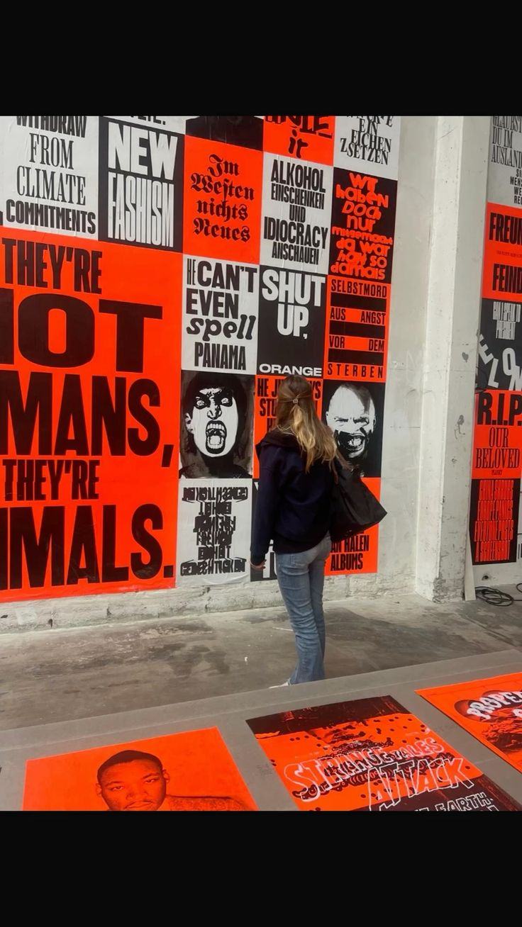
Person standing in a corridor covered in red flyers
R02 · Repetition at volume — printed matter as floor covering.
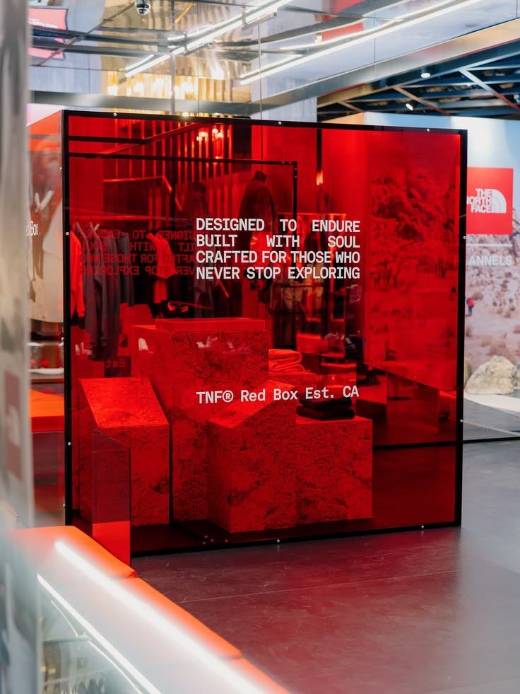
Red translucent acrylic cube installation with white type
R03 · Red acrylic as a light filter. Everything inside it turns red.
COLOUR
Flat #EC3504 across every plane. No tint variation between surfaces; the brand gradient is for screens only.
TYPE
Bone, one statement, cropped by the architecture.
LIGHT
Red uplight on the walls. Let it blow out — the over-saturation is the point.

PASTE WALL

HOW IT FILLS A SPACE

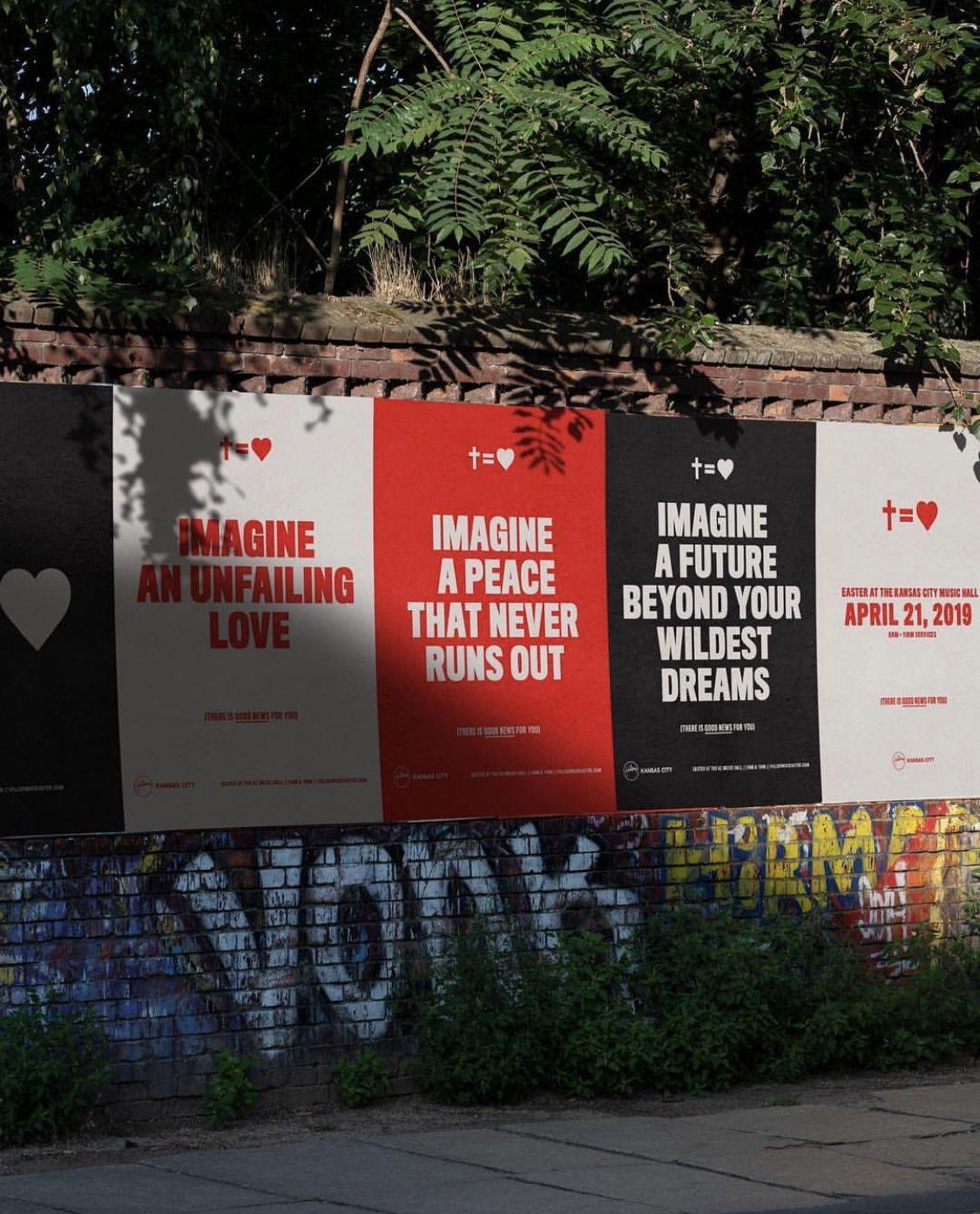
Posters in a grid, printed cheap and hung many. Alternating orange, bone and black so the wall itself has rhythm. This is the register that scales to whatever budget exists — ten posters or three hundred, the idea is the same.

HALLWAYEXTERIORINVITEMERCH
Wall covered in a grid of red and black type posters
R04 · Grid of posters as a single image. No two adjacent panels the same colour.
Row of red, white and black posters pasted on an outdoor wall
R05 · Alternating grounds across a run. One line each, one small utility block at the foot.
STOCK
Uncoated, single colour where possible. Wear is welcome.
RHYTHM
Alternate grounds. Never two of the same colour side by side.
QUANTITY
Minimum forty per wall for the effect to register.

SCREEN

HOW IT MOVES

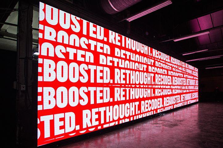
The LED wall and every in-service screen. Type tumbles, repeats and scrolls in the same orange and bone. The brand gradient is allowed here and nowhere else. Lyrics inherit these rules — words on a live surface, not words parked on black.

LED WALLWORSHIPBUMPERSCOUNTDOWN
Wide LED wall displaying repeating white type on red
R07 · Repeating line scrolling across a wide wall. Built for the LED aspect, not cropped into it.
Red display type over a black and white crowd photograph
R08 · Red type over halftone photography with small type filling the gaps.
Orange social graphic with repeating display type and a halftone photo
R09 · Repeat-and-crop layout that works identically as a screen graphic and a story frame.
MOTION
Linear scroll and hard cut. No easing, no fade-through-black.
LYRICS
Bone on orange, or orange on black. Never grey on black.
DAY ONE
No live stream on opening Sunday — switchers are on backorder. Screens are in-room only.

HAND

THE HUMAN LAYER

Brush-drawn letters over the printed system. This is what stops the season looking like a corporate rollout — one layer that was obviously made by a person, sitting on top of everything that was obviously made by a machine.

BACKDROPSSOCIALMERCHSIGNAGE
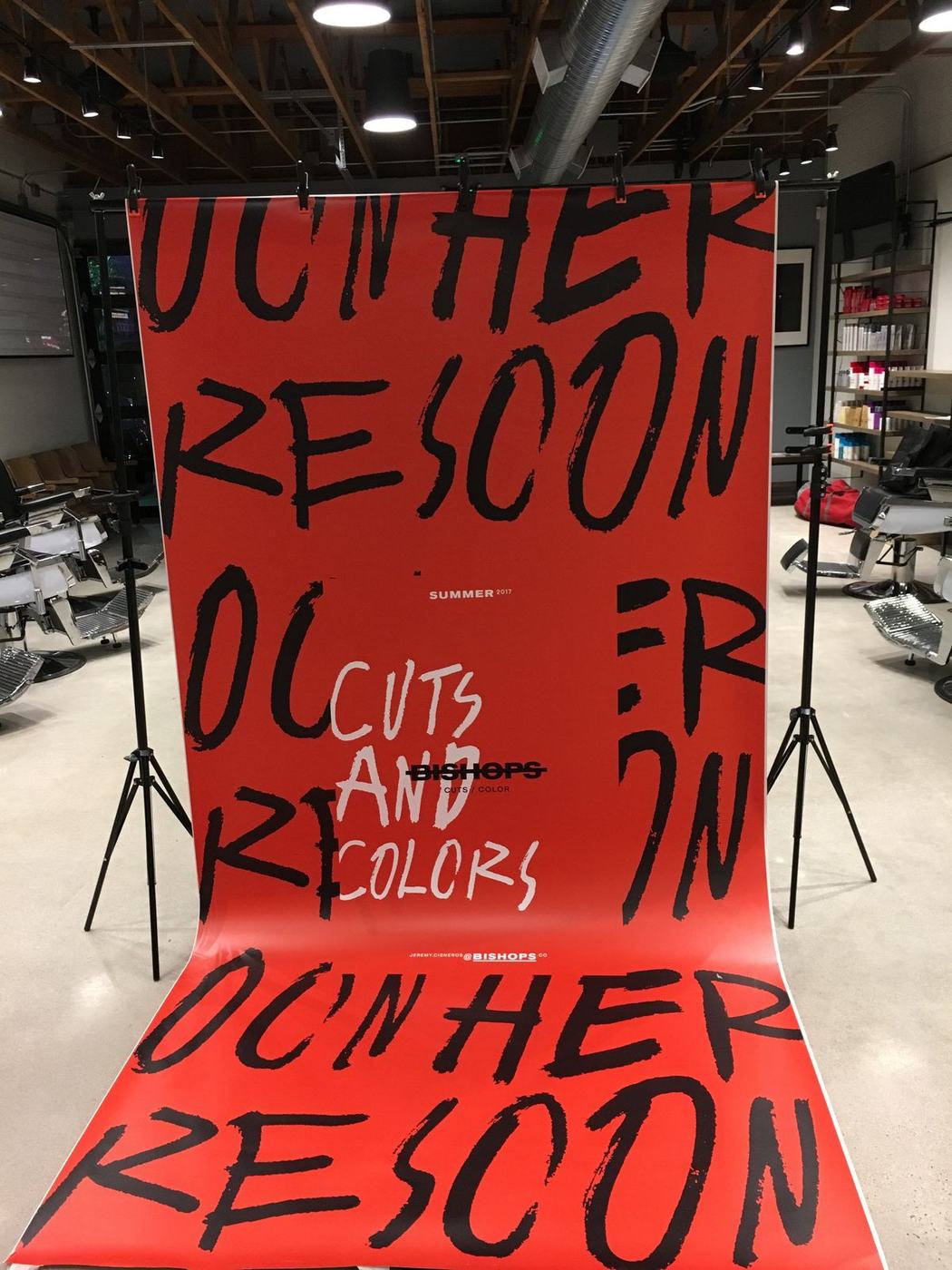
Red seamless backdrop with black and white brush lettering
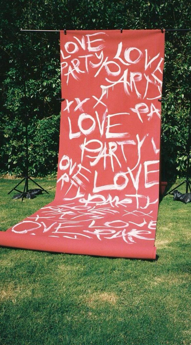
R10 · Painted seamless as a photo backdrop. Made on site, reusable all season.
Red paper roll painted with white brush lettering outdoors
R11 · Repeated hand-painted phrase. Cheap, fast, and impossible to fake in a template.
Life-size cream figure cutouts in a church lobby with dotted lettering
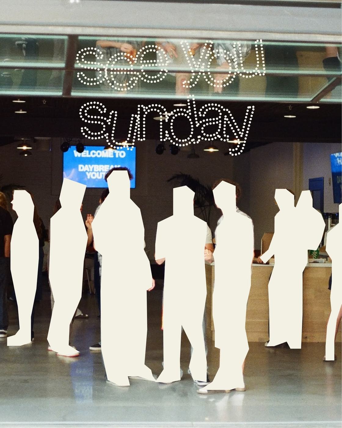
R12 · Relief moment — bone figures against the orange. Used sparingly, for contrast.
TOOL
Wide brush, one stroke per letter. Do not redraw it in vector afterwards.
RATIO
One hand layer for every four printed surfaces. It stops working if it is everywhere.
COLOUR
Bone on orange, or black on bone. Never orange on orange.
07

FILM & MOTION

The launch look has to move as well as sit still. Same rules — type at scale, repetition, red through everything — applied to a cut instead of a wall. Shot vertical first, because that is where most people will see the room before they ever stand in it.

V01 · Reference cut. Type as the subject, motion carried by the edit rather than by effects.
V02 · Reference cut. Pacing and layout treatment for the launch package.
V03 · Reference cut. Rhythm reference for bumpers and countdown.

THE CAMPAIGN MODEL

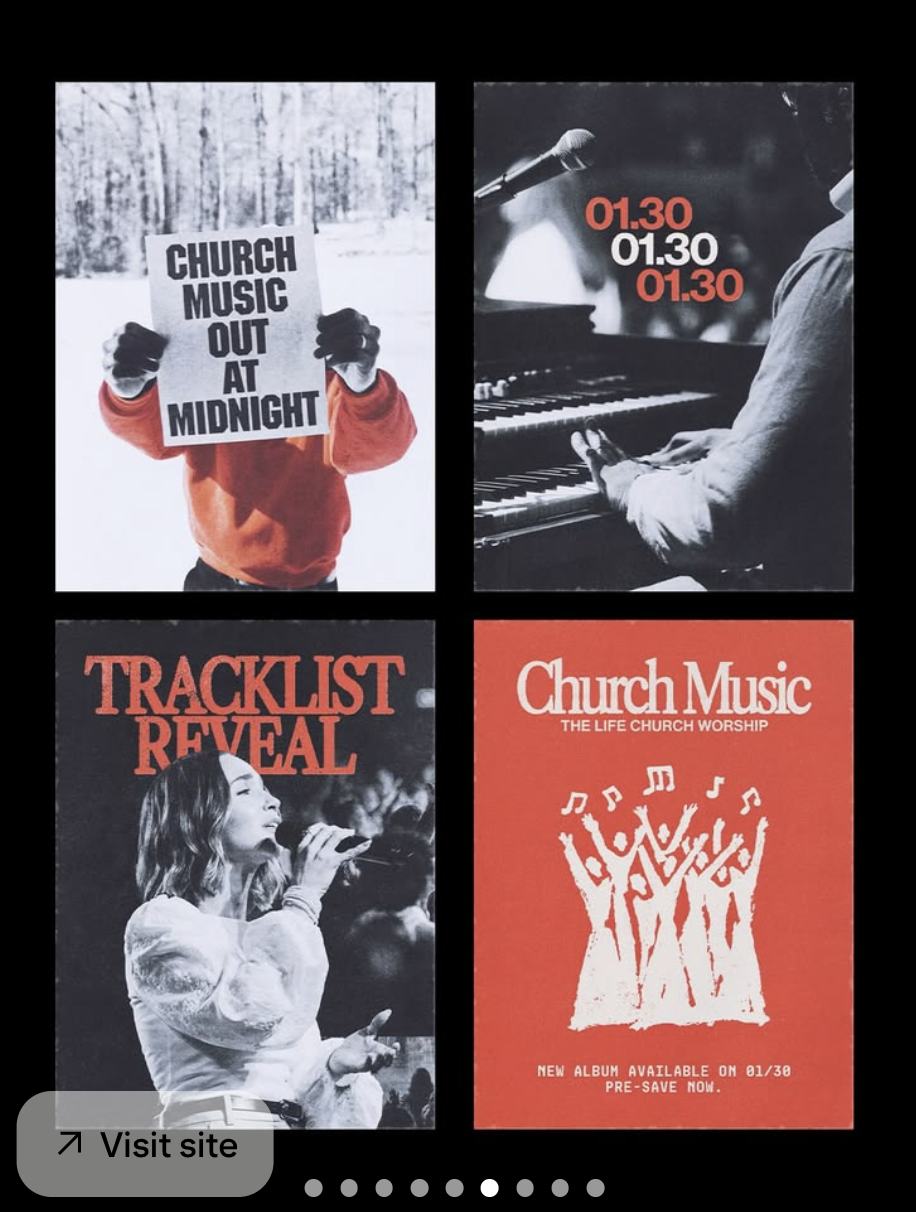
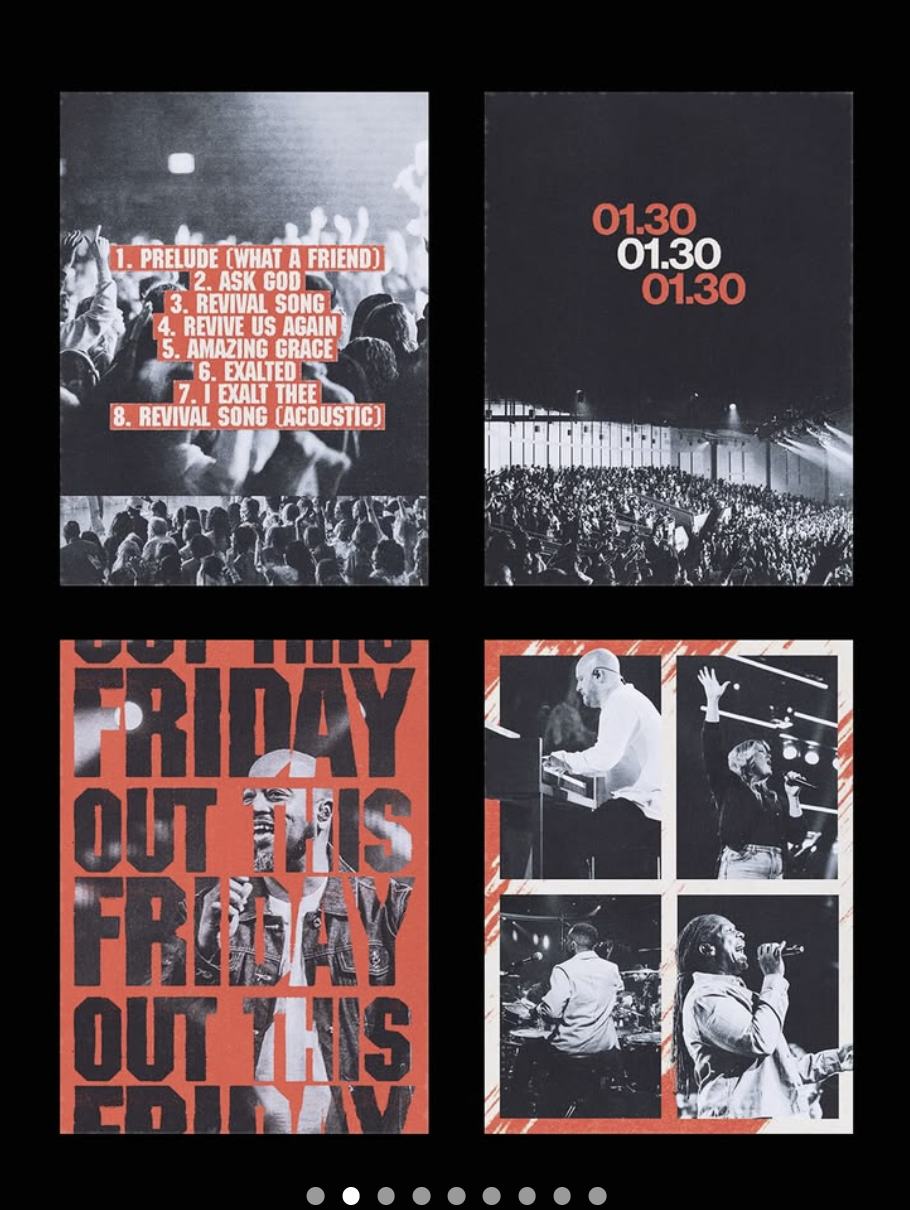
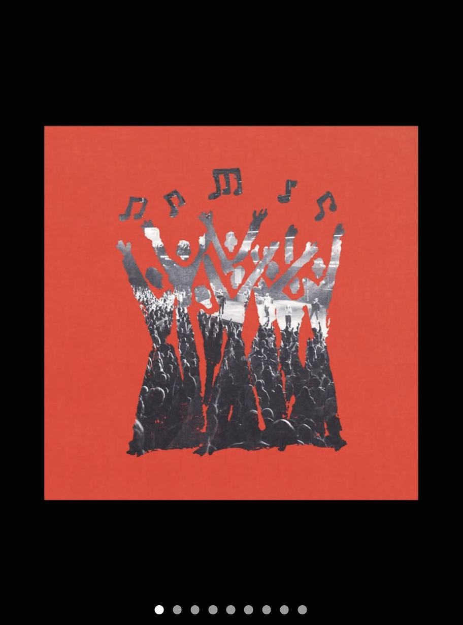
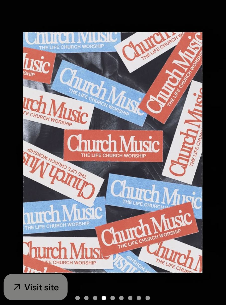
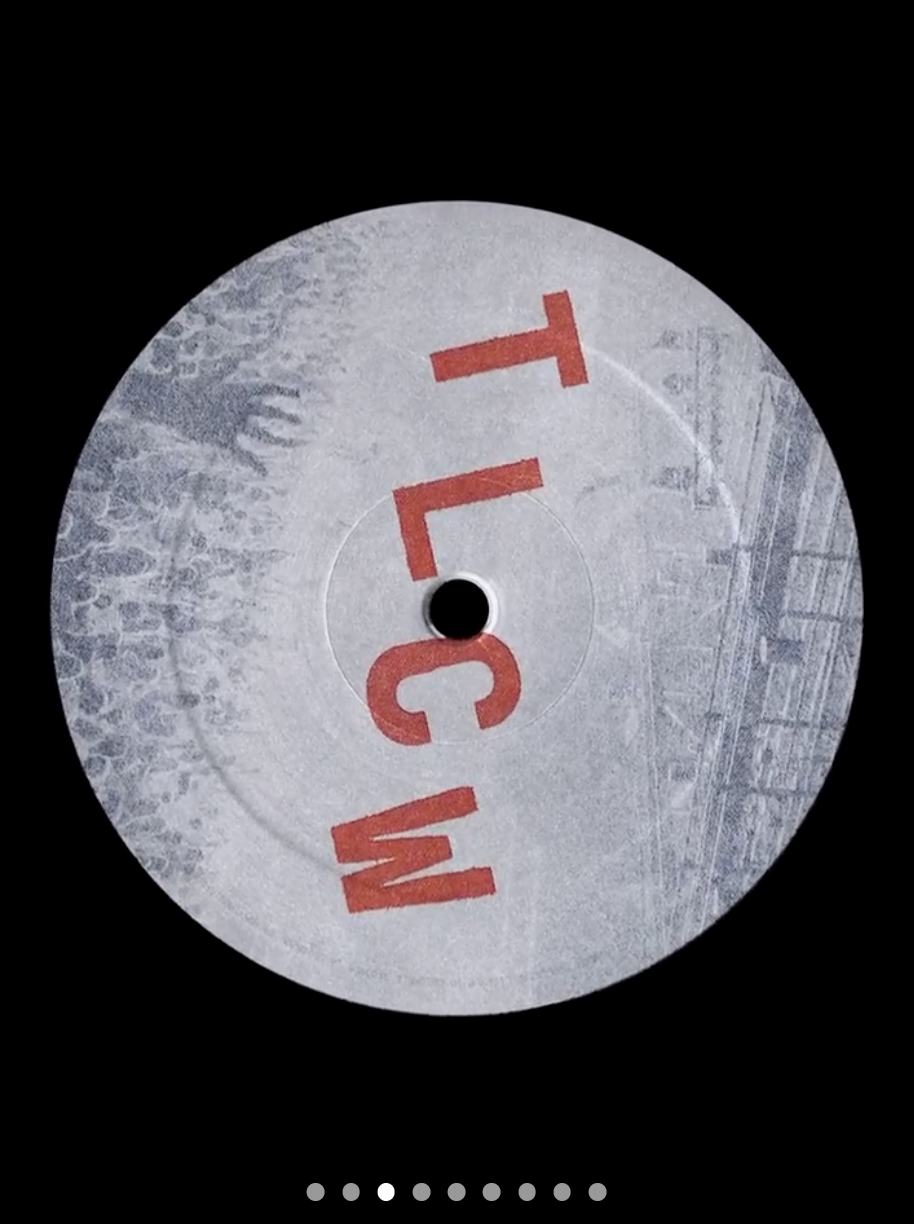
The reference worth copying structurally is an album rollout, not a church campaign. One visual world, many small pieces, released on a schedule — tracklist reveal, date card, sticker sheet, vinyl label, artist frames. Every piece is obviously from the same set, and none of them is precious.

Four campaign graphics in red, black and white including a tracklist reveal and date card
V-REF 01 · One world, four jobs. Date card, reveal, announcement, hero.
Four red and black posters including a repeating OUT THIS FRIDAY layout
V-REF 02 · Repeat-and-crop type over a portrait. Directly transferable to a countdown frame.
Red square graphic with a cut-out halftone crowd raising hands
V-REF 03 · Cut-out halftone crowd on flat red. Strong end frame for any film.
Scattered red, blue and white stickers repeating a wordmark
V-REF 04 · Sticker repetition. Physical merch that doubles as a social frame and a title card.
Vinyl record label with red letters on a grey printed ground
V-REF 05 · Object as identity. Worth making one real artefact per season.

THE FILM PACKAGE

PIECEWHENHOW IT LOOKS
LAUNCH OPENERSEPT 27, TOP OF SERVICEHard cuts, red flood, one line of type per cut. Ends on the room itself.
COUNTDOWNEVERY SUNDAYRepeating numerals in the screen register. Built to the LED aspect.
SERIES BUMPERBEFORE THE MESSAGEPostal register. Stamp, postmark, hand. Red only — no blue.
SERMON BEDBEHIND THE MESSAGESlow, dark, nothing competing with the voice. The one place blue appears.
INVITE / TEASERPRE-LAUNCHVertical native, cut fast, no date reveal until the last frame.
SUNDAY RECAPWEEKLYShot on the day, out the same week. In-room capture only on Sept 27.
CAPTURE
Vertical first, wide second. Run and gun — one operator, available light, no lockoffs.
GRADE
Push toward the palette rather than toward natural colour. Black and white footage with red type over it is the default treatment.
CUT
Hard cuts on the beat. No cross-dissolves, no fade through black.
DAY ONE LIMIT
No live broadcast on Sept 27 — switchers on backorder. Everything is captured for later, not streamed.
08

INSTALLATIONS & EXPERIENCE

The part of the season people walk through rather than look at. Everything here is built from vinyl, paper, paint and light — no fabrication, nothing that needs a shop drawing. All of it has to be installable in the week of Sept 21–26, after interior work finishes.

E01

THE ENTRY

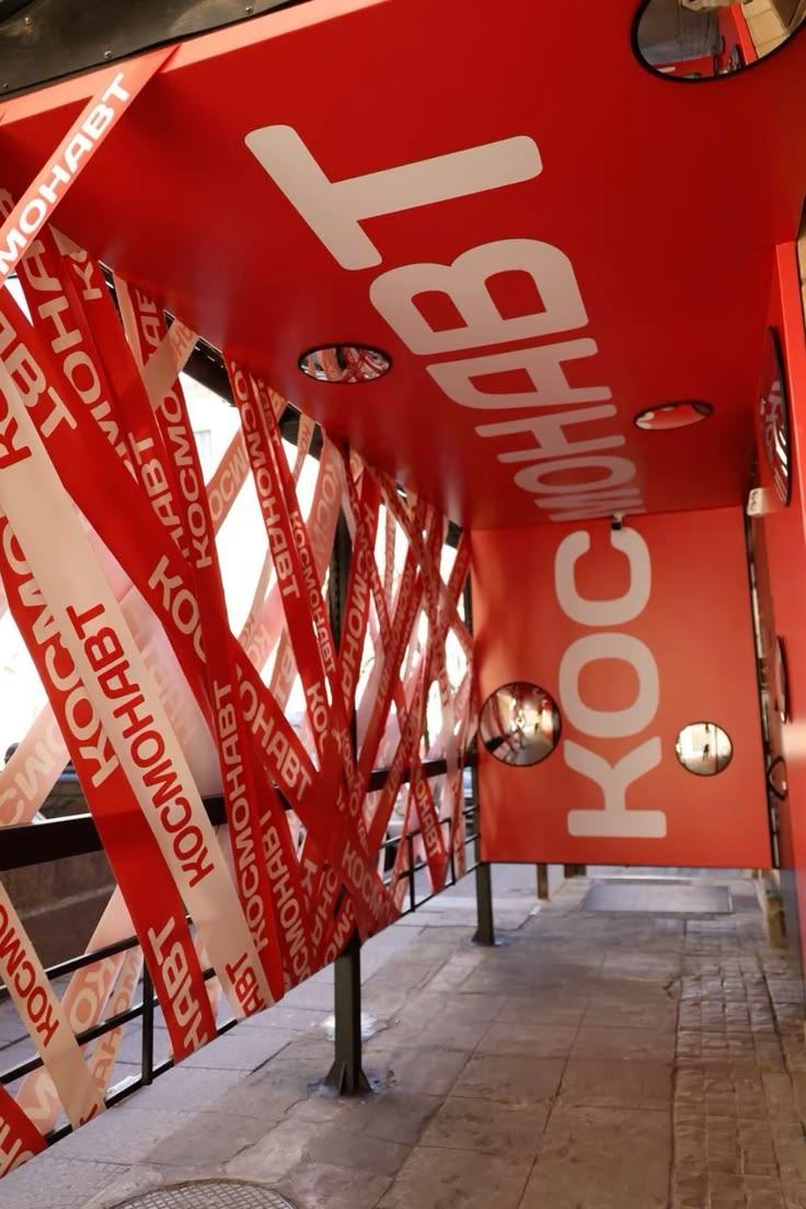
The threshold is the first installation. Banner tape printed with the launch line, strung across the entry at angles so guests physically pass through the words. Red overhead, red underfoot, type on both.

BUILD · Printed banner tape or ribbon, run between existing structure. Two people, one afternoon. Reusable for the whole series.
E02

THE RED ROOM

One room — or one bay of the lobby — taken completely red. Floor, walls and any furniture inside it. A single statement at full height on the back wall. This is the photo moment, and it does not need to be large to work.

BUILD · Floor vinyl plus wall vinyl. Red uplight in the corners. Keep the ceiling dark so the red reads hotter.
E03

THE PASTE CORRIDOR

A hallway papered wall to wall with the poster grid — alternating orange, bone and black. Placed on the route between the lobby and the auditorium so nobody can avoid it.

BUILD · Minimum forty posters, uncoated, wheatpaste or repositionable adhesive. Cheapest high-impact element in the season.
E04

WINDOW & EXTERIOR

Full-height window vinyl reading from the parking lot. The exterior walls stay exposed for inspection, so the glass carries the whole exterior identity on opening day.

BUILD · Cut vinyl, red on glass. Small mono block at the foot with service time and address.
E05

THE WALL OF MAIL

The series installation. A wall of envelopes and postcards, each one carrying a pre-written line, mounted in a grid. Guests take one on the way out. Empties gradually across the four weeks, which is the point.

BUILD · Kraft envelopes on board or string. Restocked weekly. Lines written and printed in advance — this needs copy from Pastor D.
E06

THE DROP

Freestanding red drop boxes on the platform and in the lobby. Guests post what they are sending back. Contents read and prayed over, never read aloud without permission.

BUILD · Red-painted boxes or barrels, stencilled. Cards and pencils at each one. Needs a steward assigned per box.
E07

THE PAINTED BACKDROP

Hand-painted seamless on a stand, placed where people already gather. The hand layer made physical — and a photo surface that costs almost nothing and lasts the season.

BUILD · Orange seamless roll, wide brush, bone paint. Made on site. One hour.
E08

CREDENTIAL & TAKEAWAY

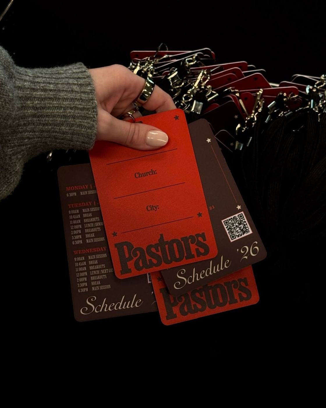
Staff and Dream Team lanyards in the launch palette, with run-of-show on the reverse. Guests get a stamped postcard invite. Both are small, both are seen up close, both are where the mono face does its work.

BUILD · Printed cards, red and kraft stocks. Rubber stamp for the hand mark — one stamp, used on everything.
E09

AV KIDS

The same system scaled down and softened — more bone and grey, less flood orange, hand layer used more. Rita is reworking kids' curriculum to the series theme for Sept 27–Oct 18, so the environment needs to match that, not the adult room exactly.

BUILD · Poster grid at child height. Painted backdrop. Note: some rooms near Av Kids may not be open pending plumbing inspection.
Entryway with red and white printed banner tape strung at angles
E-REF 01 · Entry threshold built from printed tape. Reference for E01.
Red and brown printed lanyard schedule cards held in a hand
E-REF 02 · Credential format with schedule on the reverse. Reference for E08.
Red translucent acrylic cube installation with white type
E-REF 03 · Red acrylic as a light filter — a buildable version of the Red Room. Reference for E02.

The drop boxes and the wall of mail (E05, E06) sit in the series style, not this one — their references are in section 10.
09

WHERE YOU WILL SEE IT

Which register goes on which surface. When in doubt, red flood for anything architectural and paste wall for anything printed.

SURFACEREGISTERNOTES
ENTRY / THRESHOLDRED FLOOD + HANDTape and paint. Guests pass through type before they see a sign.
LOBBYRED FLOODOne statement at full height. Uplight in red.
HALLWAYSPASTE WALLQuantity over size. Alternating grounds.
WINDOWS / EXTERIORRED FLOODCut vinyl. Carries the exterior alone while walls stay exposed.
STAGE / PLATFORMRED FLOOD + SCREENDrop boxes live here. Keep sight lines to the LED clear.
LED WALLSCREENBuilt to the wall's real aspect, never cropped into it.
WORSHIP / LYRICSSCREENBone on orange. Type on a live surface, not on black.
SERMON PACKAGESERIES + BLUEThe only place YInMn blue appears. See section 10.
SOCIAL FEEDSCREEN + PASTE WALLRecognisable before the caption is read.
STORIES / REELSHAND + SCREENVertical native. Hand layer carries the casual posts.
INVITE / PRINTPASTE WALLPostcard format for the series. Stamped, not printed to look stamped.
MERCHHAND + WOODBLOCKOne lockup, single colour on dark.
AV KIDSHAND + PASTE WALLSoftened. More bone and grey, less flood.
10

RETURN TO SENDER

RETURN TO SENDER SEPT 27 → OCT 18 · FOUR WEEKS · OCT 25 BYE
STYLE TWO · INK ON PAPER

The series keeps the brand orange and changes everything around it. Where launch is flat orange on black — paint on a wall — the series is that same orange over-inked onto paper, where it breaks up, creases and gets cancelled. It looks like something that went through the mail.

The idea, in Pastor D's framing: send it back to the maker so the maker can work on it. God sent you here and called you — at what point did you go left? The anchor text is Genesis 2, "let us make mankind in our own image." The secondary line running through the season is "you've got mail."

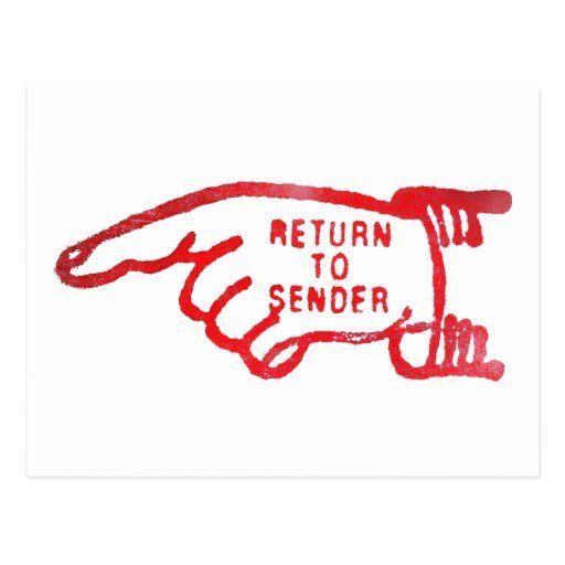
Red rubber stamp of a pointing hand reading RETURN TO SENDER
G01 · GROUNDER — The pointing hand. This is the series mark. It appears as a stamp, not as a logo: inked, uneven, printed over things rather than placed beside them.
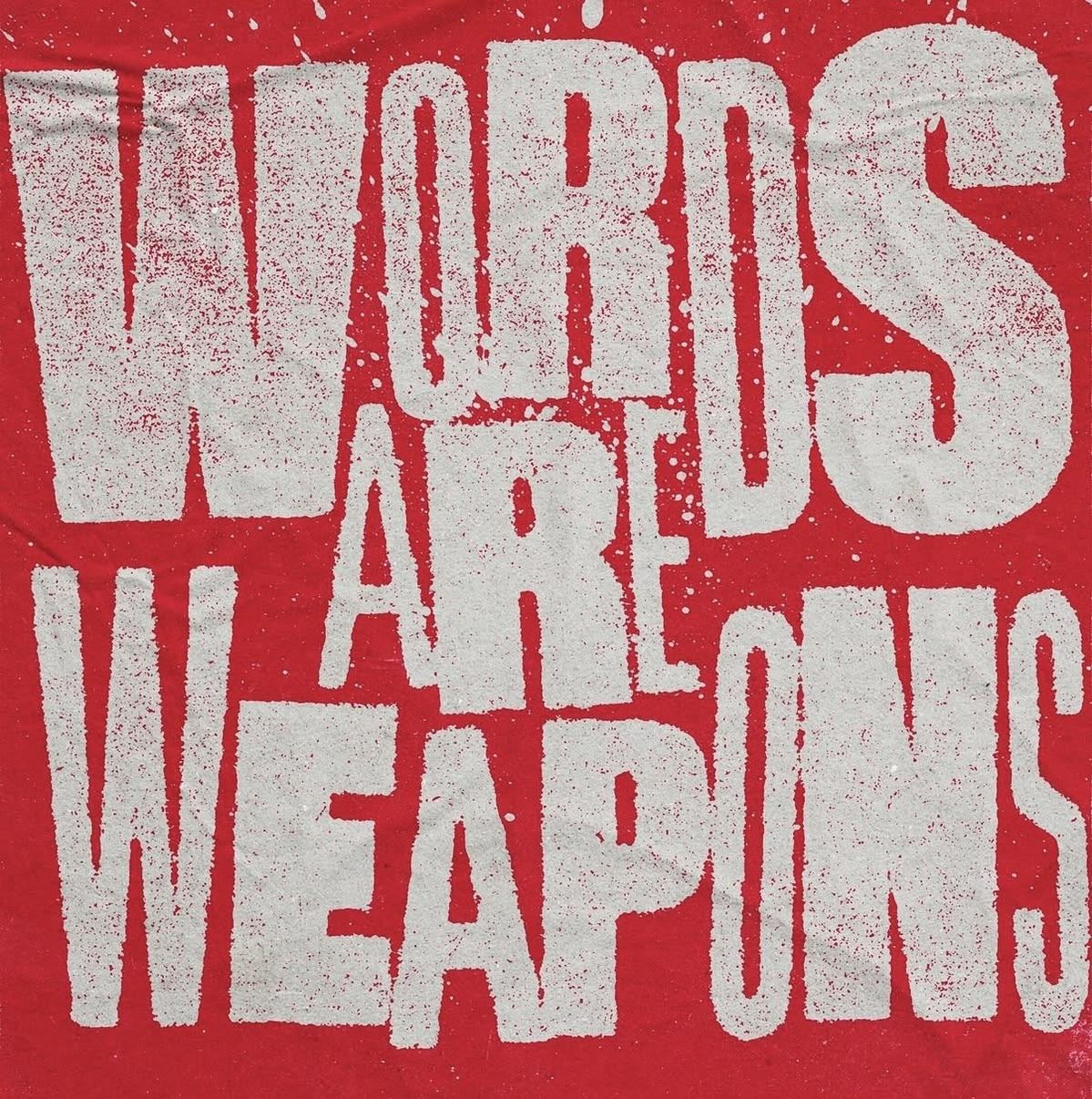
Distressed cream woodblock letterforms on a red ground
G02 · GROUNDER — The type texture. Broken woodblock caps, over-inked, on flat red. Every series headline is built to look like this impression.

THE POSTAL KIT

Real postal objects, used literally. Every letter, stamp, postmark, label and mailbox in this deck lives here — none of it appears on the launch side. These are the only decorative elements the series gets. Everything else is type.

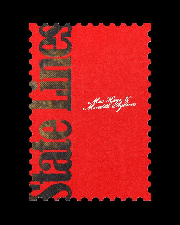
Red perforated postage stamp with black display type
P01 · STAMPThe stamp as a frame for a title. Perforated edge does the work.
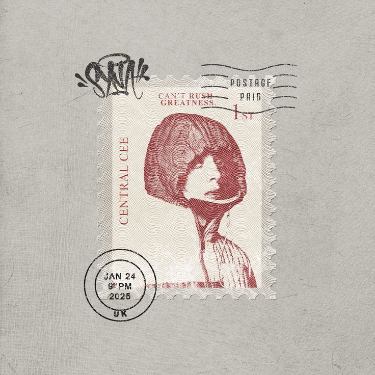
Postage stamp with postmark and signature on paper stock
P02 · CANCELLATIONPostmark struck across the stamp. Always overlapping, never beside.
Yellow postage stamp with circular postmark and signature on paper
P03 · FIRST CLASSSingle subject, wide paper margin, postmark and signature. The weekly format.
Paper layout with a stamp, a circular rejection seal and a signature
P04 · SEALRubber seal and signature layer over the sheet.
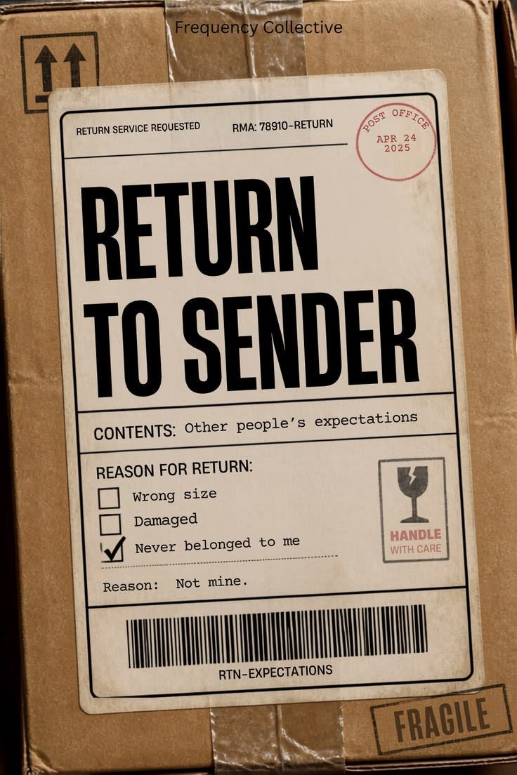
Shipping label reading RETURN TO SENDER on a kraft box
P05 · LABELContents and reason-for-return as copy. The strongest single idea in the kit.
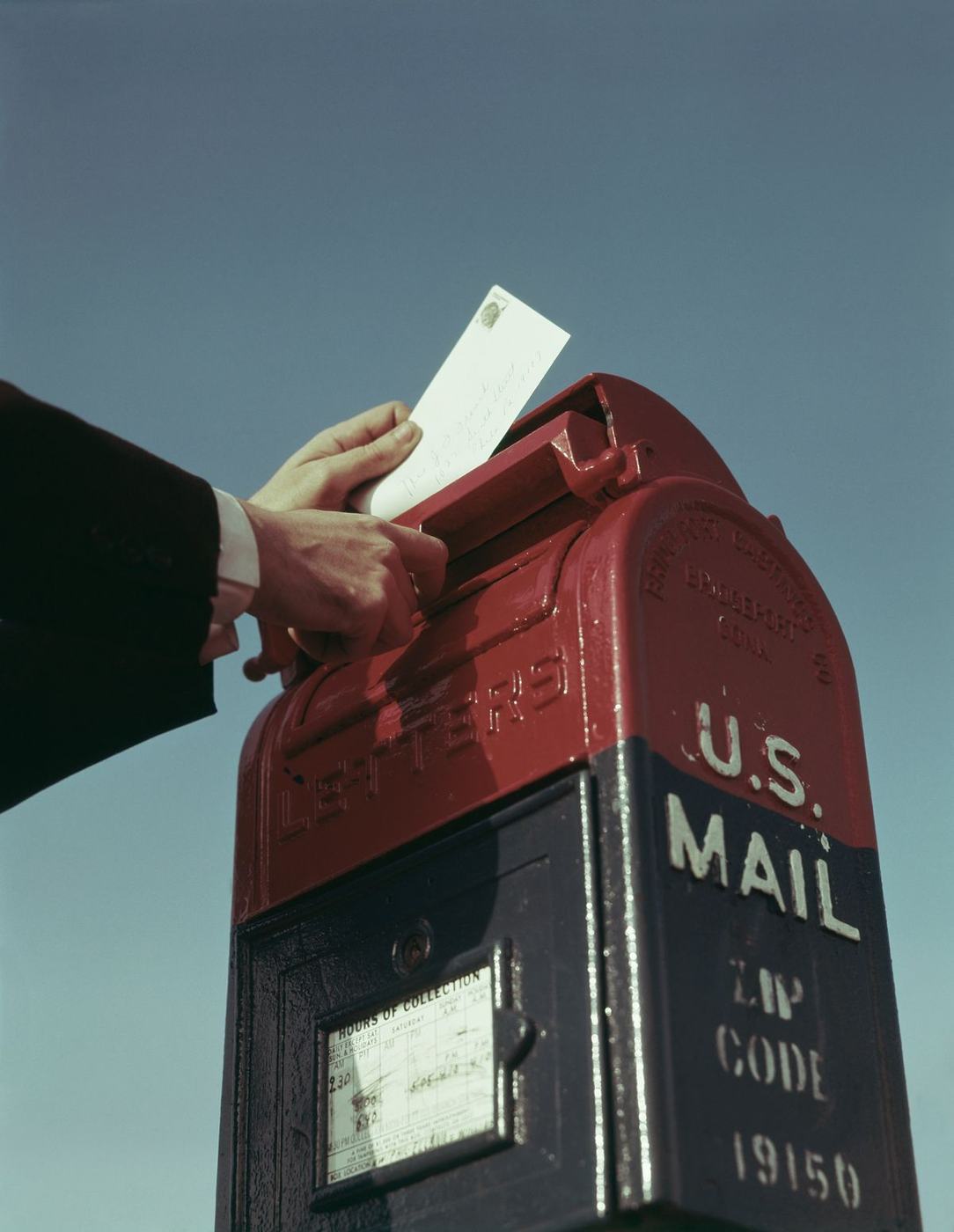
Hand posting a letter into a red and navy US mailbox
P06 · THE ACTPosting the letter. The physical gesture the drop boxes ask for.
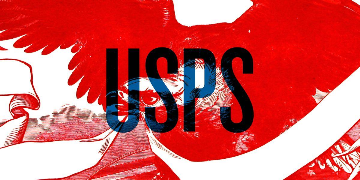
Red engraved eagle with blue and black overlapping type
P07 · ENGRAVINGRed carrying the image, type overlaid. Postal iconography at full bleed.
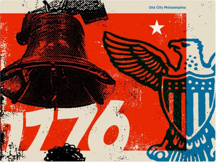
Red, black and blue halftone poster with heavy numerals and an eagle
P08 · HALFTONEImagery trapped inside the palette rather than photographed in colour.

THE IMPRESSION

How the type is printed, not what it says. Over-inked woodblock, broken edges, ink sitting on the surface of the stock. Set clean, then break it — degradation applied to good typesetting reads as intent.

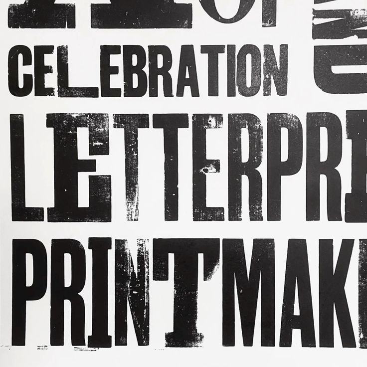
Black woodtype letterpress printing filling the frame
T01 · Woodtype. Broken edges and uneven ink — the series grounder texture.
Heavy black letterforms printed on creased orange-red paper
T02 · Ink saturation and crease on coloured stock. The texture is the print, never a filter.
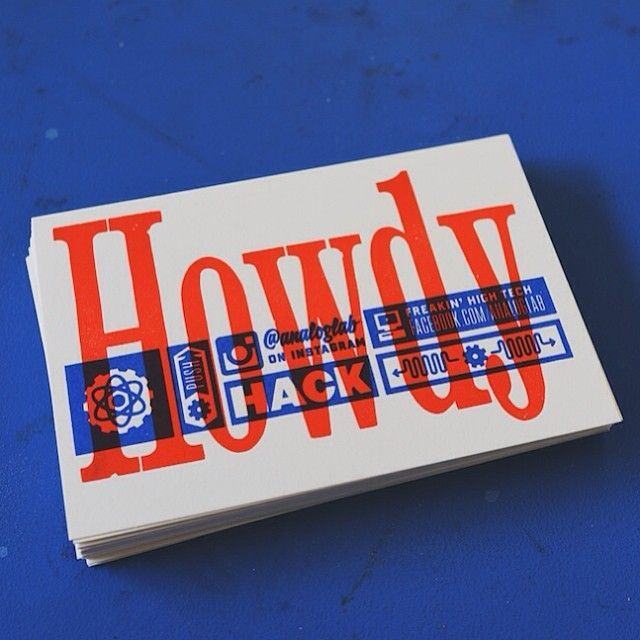
Brand system board showing red display type across covers and a stamp
T03 · One mark holding a whole set of assets together.

THE BLUE RULE

BLUE IS THE ONLY SECOND COLOUR, AND ONLY IN THE SERMON PACKAGE.

Message titles, scripture slides, lower thirds and sermon notes — that is the full list. It does not go on social, environment, merch, invites or the LED worship set. Ave orange stays the through line across every surface so the blue reads as a signal when it does appear, and so the season never looks like two competing brands.

Grid of blue and cream postage stamps on a navy ground
B01 · Stamps as a grid system for a run of slides. Blue against paper.
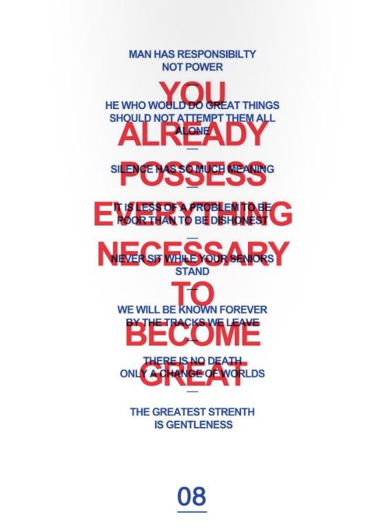
Red display type overlaid on smaller blue type
B02 · Red headline, blue supporting text underneath. The correct ratio — blue never leads.
Letterpress card printed in red and blue overprint
B03 · Red and blue overprint with slight misregistration. Print reference.
Book cover with blue brush lettering and a red mark on bone paper
B04 · Blue and red on bone stock, hand-drawn. Weight balance reference.

WHAT THE SERIES STILL NEEDS

ITEMSTATUSOWNER
WEEKLY MESSAGE TITLESOUTSTANDINGPastor D — four titles, needed before artwork
BOOTZY CONDENSED TMTO PURCHASEYNG — licence from 6TM
ENVELOPE / DROP-BOX COPYOUTSTANDINGPastor D — pre-written lines for E05 and E06
AV KIDS CURRICULUMIN PROGRESSRita — reworked to the mail theme
LAUNCH WEEKEND OPENERSTO DISCUSSPastor D + D'Nar, offline
11

SOCIAL & DIGITAL

From launch week, the whole Avenue Tampa presence moves into this look. Not a few launch graphics posted among normal content — normal content published during the season should look like it belongs to the season too.

Someone scrolling should recognise Avenue Tampa before they read the caption. That is the test, and it is the only test that matters here.

STREAMREGISTERWHAT IT IS
FEEDSCREEN + PASTE WALLRepeat-and-crop type layouts. Halftone photography inside the palette.
STORIES / REELSHANDVertical native, made fast. The hand layer lives here.
ANNOUNCEMENTSPASTE WALLPoster format. One line, one utility block.
SERIES POSTSPOSTAL KITPaper ground, stamp and postmark. Red only — no blue.
SUNDAY CAPTURESCREENShot on the day, cut and out the same week.
MASS EMAIL / TEXTPASTE WALLFires at launch week. Single image, single line.
12

WHAT IS COMING

Build finishes the week before, the season opens on the 27th, and the series runs four Sundays from there.

SEPT 21

INTERIOR COMPLETE

Paint, acoustic panelling, LED wall, lighting and seating targeted done. Exterior walls stay exposed for inspection.

SEPT 22

MARKETPLACE & LOBBY

Lobby finished. Installation window opens — everything in section 06 goes in from here.

SEPT 22–26

INSTALL WEEK

Vinyl, paste corridor, entry tape, drop boxes, painted backdrop, credentials. Photograph the room before anyone is in it.

SEPT 27

LAUNCH SUNDAY · RETURN TO SENDER WEEK 1

10:00 AM service, 8:00 and 8:30 rehearsals. No live stream — switchers on backorder. In-room capture only.

OCT 4

WEEK 2

Envelope wall restocked. First Sunday recap cut and out.

OCT 11

WEEK 3

Paste corridor refreshed with the second poster run.

OCT 18

WEEK 4 · SERIES CLOSE

Drop boxes emptied and prayed over. Season capture edited.

OCT 25

BYE WEEK

Guest speaker, alternate service type, or youth takeover. Environment stays; series graphics come down.

13

WHAT IT IS, AND IS NOT

WHAT IT IS

  • Ave orange #EC3504 on every surface all season, launch and series both — the church's own colour, never a new one
  • Type at the scale of the building it is on
  • Quantity over size — many cheap things, not one expensive thing
  • One hand-made layer on top of a machine-made system
  • A room that tells you where you are without a sign
  • A series that lives inside the launch, not next to it

WHAT IT IS NOT

  • Two campaigns competing on the same Sunday
  • Blue anywhere outside the sermon package
  • A second red, or any orange that is not #EC3504
  • Gradients, drop shadows, or softened red
  • Stock photography of people who do not go here
  • Type centred in the middle of an empty rectangle
  • Distress used to cover up typesetting that was never set properly
14

WHAT WE NEED

Ordered by what blocks the most work. The first two hold up artwork entirely.

Four weekly message titles. Series artwork, slides, social and the envelope wall all wait on these.
PASTOR D
Bootzy Condensed TM licence. Series display face. Purchase from 6TM before any series artwork begins.
YNG
Helvetica Now Display licence, and the brand gradient artwork. Both named in the 2025 brand guide — confirm Ave already holds the font licence and send the gradient file.
AVE
Pre-written lines for the envelope wall and drop boxes. Volume needed for four weeks, not one.
PASTOR D
Install access from Sept 22. Confirmation that lobby and hallways are clear for vinyl and paste.
FACILITIES
Print quantities and budget sign-off. Poster count drives the whole paste-wall effect — forty per wall is the floor.
BRANDON
A steward per drop box. Someone owns each one on Sunday, including what happens to the contents.
CHRISTIAN
Av Kids environment scope. Confirm which rooms are open pending plumbing inspection.
RITA
LED wall resolution and aspect. Needed before any screen content is built, so nothing gets cropped on the day.
PAUL